Resort Leaders Website

Project timeline

Apr - Aug 2024

Designer & Developer

Ruoxin You

My Contribution

UX/UI Design
Content Design
Webflow Development

Impact
  • đŸ”„ +185% increase in user engagement. Visitors explored more pages and stayed longer, interacting meaningfully with the content.
  • 🔁 2× retention rate. More users came back, showing stronger interest and clearer value perception.
  • 🎯 Registration goal hit. The redesigned site helped the business to drive signups and contributed directly to year-over-year growth.
Context
A Site That Couldn’t Keep Up
Resort Leaders is an educational travel brand connecting students with seasonal resort jobs in the U.S. The previous website hadn’t been updated in years—its visual style was outdated, and the content structure had become cluttered and hard to navigate.
With the company transitioning to Webflow for better flexibility and faster iteration, I was tasked with leading the redesign. This was a chance to modernize the site, improve the user journey, and present the brand in a clearer, more engaging way.
Goal
  • Modernize the visual design: Refresh the overall look and feel to be more current, clean, readable, and on-brand, without leaning into short-lived design trends.
  • Increase user engagement: Clarify our service offering and guide users through the journey with storytelling and strong visual cues that help them imagine the experience.
  • Optimize for mobile: With over 70% of traffic coming from mobile devices, the new design needed to be fully responsive, fast, and intuitive on smaller screens.
Kick-off
Understanding Our Visitors

Before diving into wireframes or pages, I started by asking: How should we introduce the program to our visitors? Our service is complex, and visitors arrive with different levels of familiarity. To design a clear and engaging experience, we needed to first understand how people learn about us and what they’re really looking for.

Step taken:

  • Quickly identified main user mindsets and entry points (search, referral, social) from our sale team and marketing team
  • Empathy different group of users, highlight their goal of visiting
Wireframe
Start with the Story

Visitors come through search, social media, or referrals. Some already know a bit about us; others are simply inspired by the idea of working and traveling. They arrive with different levels of understanding. And we offer two distinct programs: one for summer work and travel, the other for structured internships. Each targets a different audience with different goals.

Our challenge was to communicate this clearly and quickly, so users could find the right fit from the start.

My solution:

  • Homepage as a Narrative Arc, and use it to segment users at the start
  • Nav and footer as map: group info into keywords
  • Within pages: Prioritized clarity over hierarchy—users don’t need to read the whole site to understand what to do next
Wireframe
Rearrange the story page by page

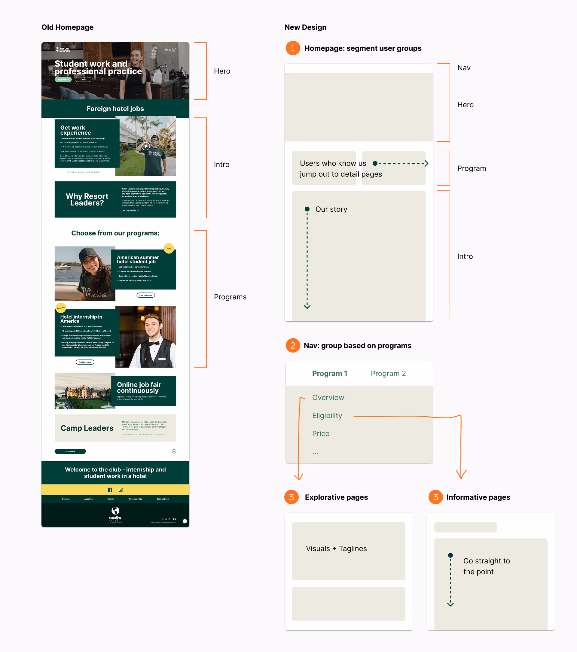
Let’s take the homepage as an example.

The homepage has two key goals:

  • Help users find the program that fits their needs
  • Introduce our programs and brand to build trust

My approach to structuring the story:

  1. Researched best practices for high-performing marketing websites and summarized common principles and layouts
  2. Applied those insights to our context—writing content based on brand knowledge, input from program directors, and existing materials
  3. Quickly drafted mid-fidelity prototypes to bring the structure to life and test the flow

I prefer jumping straight into mid-fidelity prototypes. Because for marketing websites, too many placeholders make it hard to see the vision, like judging a meal by a pile of raw ingredients.

Design
Evolving from Mid-Fi to Meaning

Even though I made it clear the mid-fi was just a prototype (and the final visuals would change), I still got a lot of feedback that the page looked “too corporate.”

As we discussed further, I realized two things:

  • Visual style is inseparable from storytelling. It is part of the message.
  • It wasn’t just the visuals, but also the structured, uniform layout that made it feel too serious.

So in the next stage, I gave visual design the attention it deserves. I focused on:

  • Striking a balance between travel and internship aesthetics
  • Staying aligned with the brand guide
  • Starting with strong imagery, since visuals play a central role in our site
Design
Design Every Page, Then
 Iterate!

Once the overall storytelling and tone were aligned with the team, I moved on to the sitemap and then focused on each page individually. The approach remained consistent: understand how visitors interpret our program offerings, design the site structure accordingly, define each page’s flow, and apply the homepage’s visual style throughout.

This stage involved close collaboration with stakeholders across teams. While the process may sound intuitive, it was deeply informed by their experience and feelings. Many had worked with our programs and brands for years. My role was to:

  • Understand their needs and goals
  • Offer perspectives from both a designer and a fresh-eyed user
  • Translate discussions into clear, purposeful design decisions
Development
Wearing the Developer Hat: Webflow Build

After receiving the go-ahead from our final design review, I moved into development using Webflow. Although I had experience building smaller sites, this project introduced a new level of complexity.

To ensure scalability and maintainability, I customized a clean Webflow template and created a solid project foundation:

  • Defined global color variables
  • Built base classes and reusable components
  • Emphasized componentization for easier long-term updates

This shift from designer to developer required a new mindset: one that demanded structure, logic, and strategic planning before laying down a single element.

Test
Internal Feedback

We scheduled feedback sessions after the site was built. Why?

  • As both designer and developer, I could iterate quickly. Webflow made changes faster than a traditional design handoff or Figma prototype.
  • Websites are hard to simulate. Real feedback comes when users explore freely, not when they follow assigned tasks.

I invited both the marketing and tech teams to explore the site freely and share their impressions from both personal and professional perspectives. The result was a 13-page document filled with insights, ranging from content suggestions and usability concerns to emotional reactions and bug reports.

To manage the feedback efficiently:

  • I categorized comments by page and section
  • I used color-coded tags to track their status: fixed, in progress, not changing (with rationale), or postponed for future testing
Test
Usability Test: Testing with Fresh Eyes

Internal feedback was valuable, but it came from people too close to the project. What we needed was a fresh perspective:

  • How would first-time visitors explore the site and make sense of the information?
  • How would they interpret the overall journey and experience?

Usability test required careful planning. Unlike app testing, usability test for website demands more open-ended tasks. We couldn’t just assign actions. We had to let participants explore naturally and share what they found useful.

To keep it simple and fast, we invited four colleagues from non-program teams—like accounting and admin—who weren’t familiar with the content. We asked them to act as potential participants and see what information they could uncover.

What I learned and changed:

Design
Final Design Showcase

The design focused on three core goals: modernizing the visual style, increasing user engagement, and optimizing for mobile.

Here’s how I refreshed the visual identity and encouraged deeper interaction:

For responsiveness, Webflow allowed real-time adjustments across screen sizes—not just desktop and mobile, but everything in between. This ensured a consistent and smooth experience regardless of device.

Collaboration
Localizing the Website: A Global Rollout

Bringing the design to life involved much more than visuals. I was hands-on in areas like stakeholder communication, website performance optimization, relocation setup, and localization.

Localization was a unique challenge. We needed to translate the site into 8 languages, which meant collaborating closely with multiple country offices to update content. While Webflow made the process smoother, it was still a new tool for most colleagues.

To support the rollout:

  1. We hosted a kickoff meeting to introduce the tool, process, and how local teams could contribute
  2. Created a dedicated support channel to answer real-time questions
  3. I documented complex structures and frequently asked questions in a shared guide
  4. Included Loom videos in the doc to walk through more advanced logic and workflows
Reflection
  1. Designing for marketing requires a mindset shift: Usability and readability are important, but not always the top priority. I learned to focus on storytelling logic and emotional impact—especially in marketing contexts like Smaller Earth Group.
  2. Navigating design noise: With many opinions in the mix, clarity of direction was essential. I learned to filter feedback, align with the core goals, and maintain coherence throughout the design process.
  3. Thinking like a developer: Building the site in Webflow helped me approach design more dynamically—factoring in responsiveness, animation, and performance from the start.