May 2025
Work project
Ruoxin You
Adam Maddocks
Research
UX/UI Design
Prototype
Test

This started as a small side project. The goal was to add an AI checker to the Skill section of our platform, similar to other products we researched, so users could see feedback on their responses based on predefined prompts.
The Product Manager wrote prompts informed by prior user answers and interviewer feedback. The AI evaluates responses at three levels:


I quickly reviewed AI design requirements and researched similar features in live products. Because it seemed simple, I wasn’t given much time. Our PM and I held a brief meeting to explore a few options and chose one that fit our limited development resources. We implemented and shipped it.

A few weeks after launch, our PM reported a problem: most users stopped at the “Moderate” skill level and didn’t try to improve their descriptions further. As a result, they weren’t discovering or using the grammar refinement feature.
We initially considered two approaches:
After talking to our customer support team, I discovered many students simply had little to say because of limited experience. Even when contacted directly, they often left their skill descriptions mostly empty.
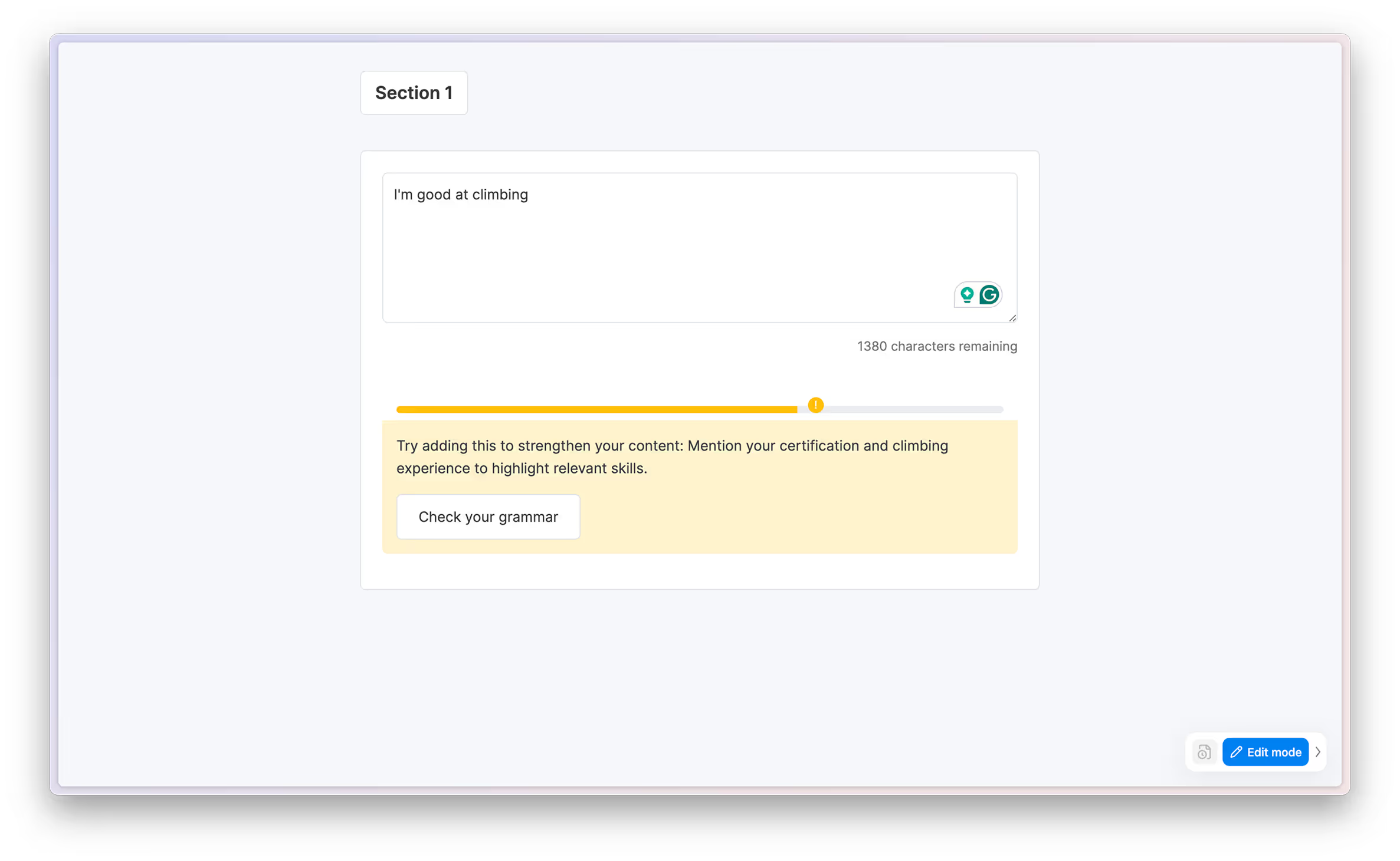
This insight shifted our approach. We decided to show content-refinement suggestions and also allow grammar/structure refinement for those who genuinely had little to add. Together with PM and support, we tweaked the AI checker logic:


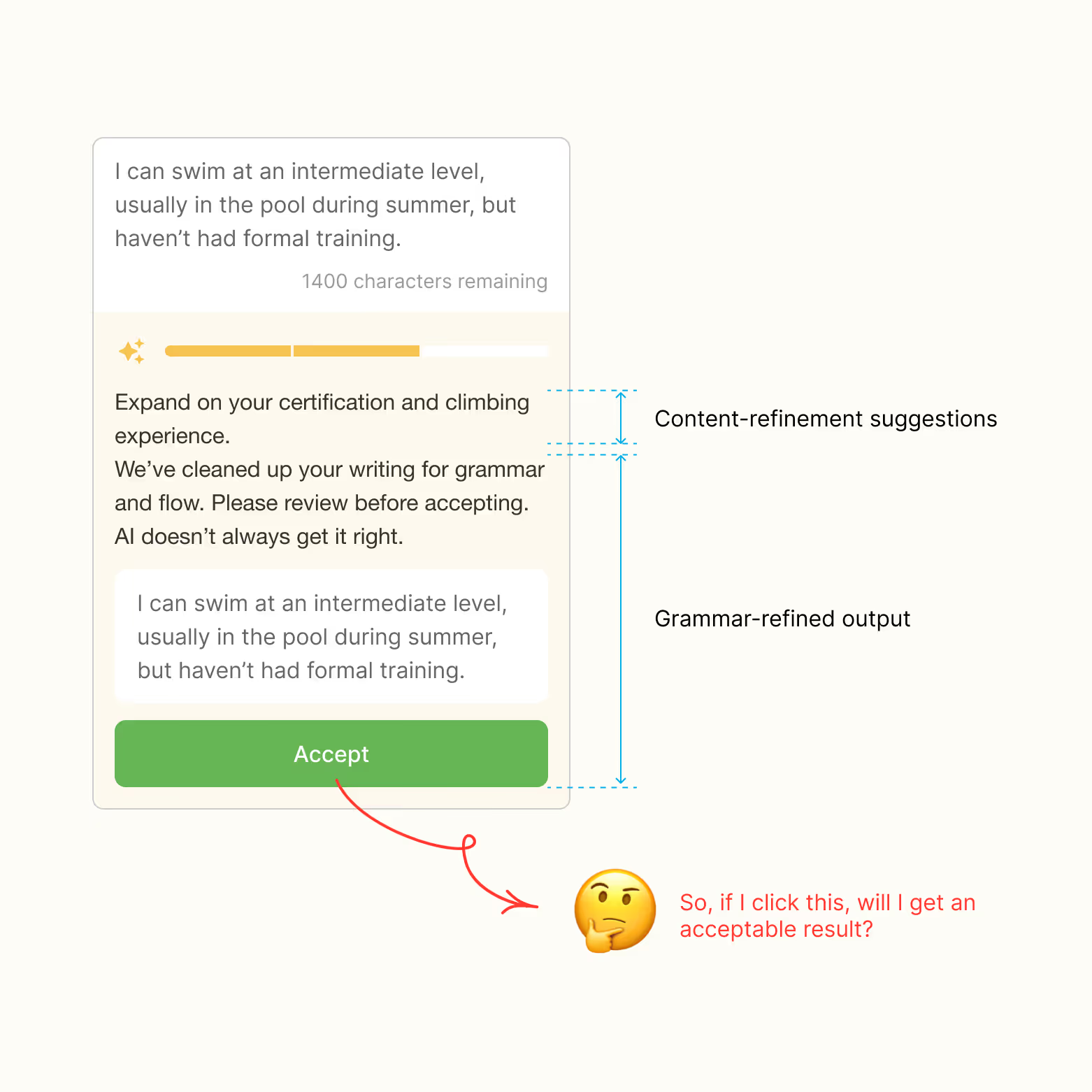
With the feature rules defined, I moved to ideation. Initially, I wanted to mimic our previous pattern: AI content suggestions as a paragraph on top, with a preview box showing the refined version and an “Accept” button.
But this quickly felt confusing - especially at medium level where both suggestions appear. The accept button looked like a one-click solution for everything, but in reality it only refined writing, not content. Also, the previous logic reloaded the interface every time the user changed content, which conflicted with the new workflow.

After reading AI design guidelines, examining advanced AI products, and brainstorming with ChatGPT, I grouped my ideas into two directions:

When I presented these ideas to the product and tech team, our tech manager preferred the second option and suggested automatically re-running AI every time the content changed.
My first thought was, honestly, a bit of panic. It seemed like it could be annoying, with constantly shifting output and no way to pause it. But the rest of the team liked the idea. Rather than rejecting it outright, I proposed we explore it further.
I was the only one with reservations, so I decided not to push back immediately, but to experiment with design trials after the meetings.
I still held the opposite opinion and was debating whether to push back or propose a compromise, like keeping auto-check but adding a pause button so users could turn it off. Then I realized I could prototype their idea to directly showcase the unpleasant feelings. Since I was keeping up with AI tools closely, I quickly built a demo using ChatGPT to refine prompts and Manus to generate an interactive prototype.

Surprisingly, the demo showed the experience wasn’t as annoying as I feared. Because this was more like a questionnaire than a resume builder, users naturally wrote short sentences. Setting the auto-check with a slight delay (I tested 1 second) actually helped me complete my own skill description faster.
I shared the demo with colleagues; none found it annoying, and they liked the feature. That’s when I changed my mind and agreed to implement automatic checking.

According to feedback from our customer service team, the quality of participants’ answers has noticeably improved since introducing the AI checker.
(Note: At present, we don’t have quantitative data to demonstrate this impact.) Reasons:
This project was full of surprises:
Although this started as a small trial, it revealed the potential of AI-powered UX in our product. I’m continuing to learn and experiment with AI design to bring even more value to users.